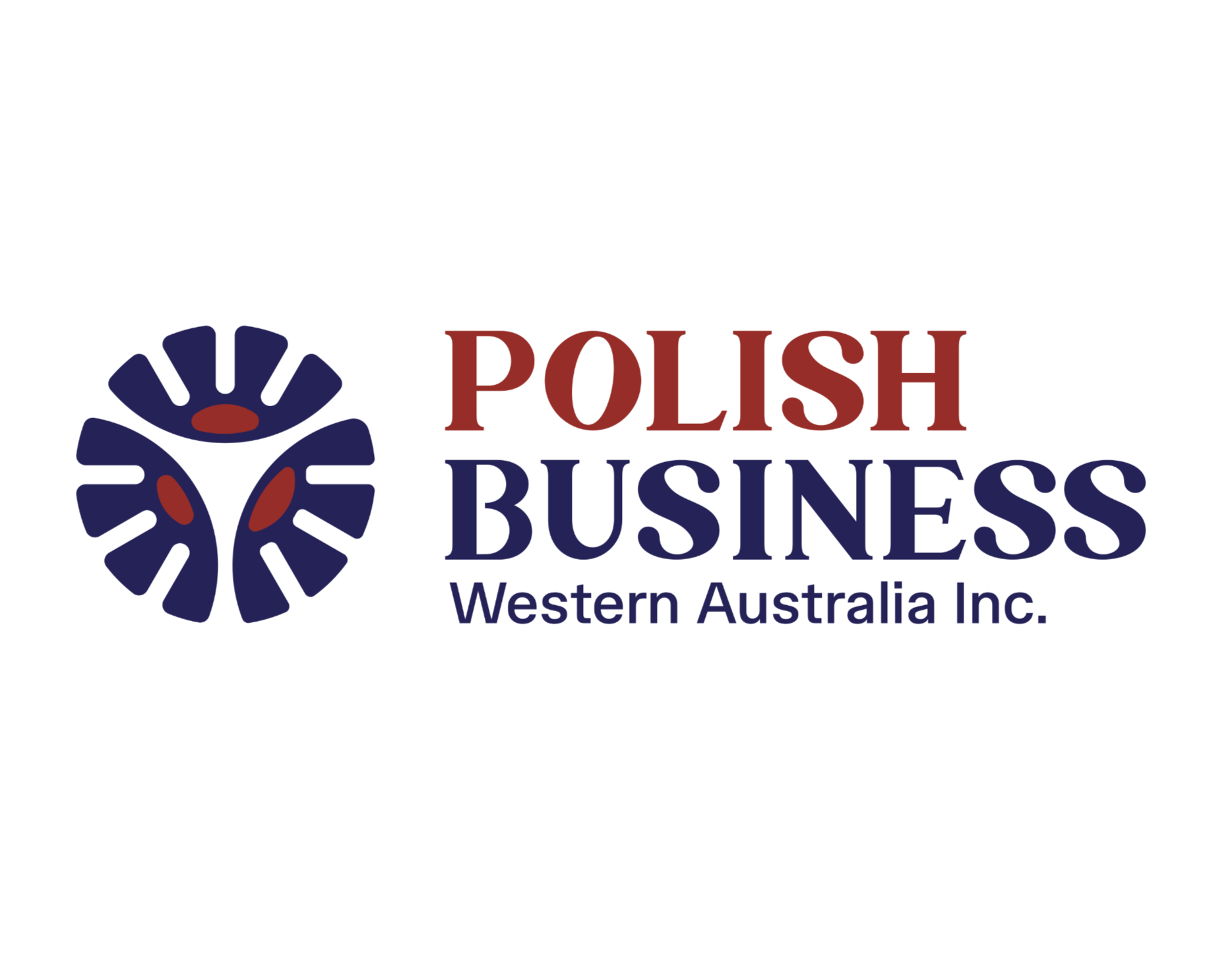
Polish Business WA Unveils Official Logo
Polish Business WA is proud to reveal its official logo, symbolising the connection between Polish culture and the professional community here in Western Australia.
Design Inspiration
The logo blends native Australian flora with Polish folkloric floral motifs, representing the cultural link between both nations.
Symbol Meaning
Three floral elements form a unified circle, representing:
- Australia
- Poland
- Polish Business WA
This circular shape also subtly references the Western Australian sun, reflecting continuity, growth and community.
A Cultural Touch
The form of the floral pattern is inspired by the crown of the Polish eagle, adding a proud national reference.
Colour Palette
- Red recognises Polish heritage
- Royal blue draws from the Australian flag
- Darker tones convey professionalism and credibility
Typography
A mix of serif and sans-serif fonts balances:
- Traditional Polish elegance
- Modern Australian design
A Symbol for Our Future
Bold, confident and culturally connected, this identity reflects our mission to empower Polish business owners, professionals, students, graduates and newcomers across Western Australia and beyond.
Unified, connected and proud.